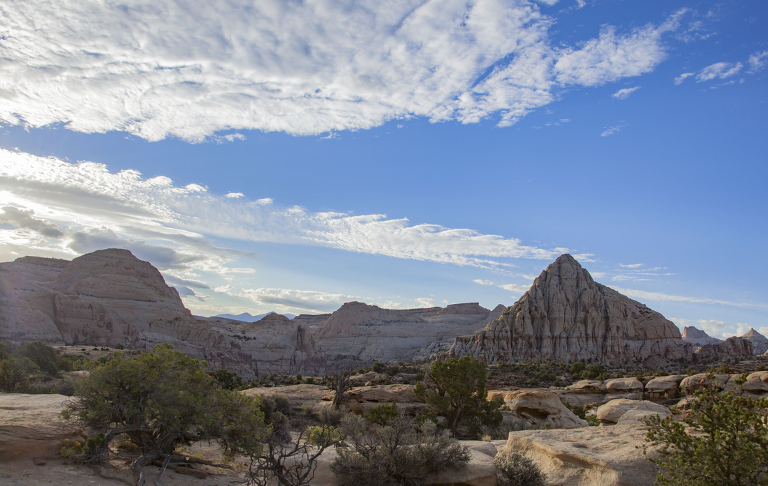
Exhibit 1 - Camera Raw
This photo was taken while I was visiting Capitol Reef National Park. In order to enhance the image, my post production involved editing the image in Bridge and Camera Raw. I brightened the shadows and the highlights so that the landscape was more visible. The "before" image was much darker. After working on the brightness I worked on decreasing the amount of haze shown in the photo. I increased the contrast and saturation in order to bring out the colors of the trees and sky. I also used the crop tool to straighten out the horizon line and place it in the lower third of the image in order for it to be more pleasing to the viewer's eye.
Skills used:
*contast
*saturation
*haze
*brightness
*shadows
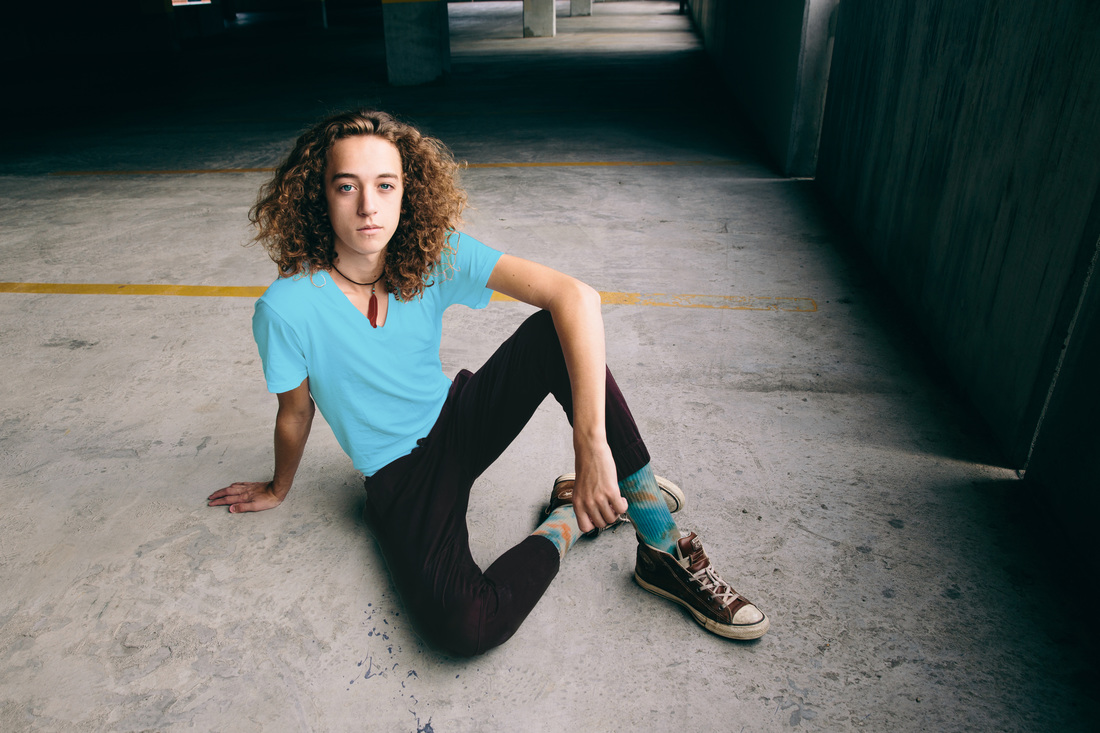
Exhibit 2 - Photoshop Tools
After practicing with the different tools found in Photoshop, I picked this photo that I took to try out some of the brushes and tricks I learned from Lesson 3. The boy shown above originally had a on white t-shirt, purple pants, a brown feather necklace, light blue tie-dyed socks and had light blue eyes. With the tools in Photoshop, I was able to alter the colors of these parts of the photograph. I started with the eyes and decided that I wanted to make them more of a blue-green instead of a light blue. I used the brush tools to do this and set the opacity to 40% with the "multiply" blend mode. The feather on the necklace was changed from a brown to the same color of red as the beads above the feather using the brush and eyedropper tool. The opacity was set to 50% and was on the "normal" blend mode. Next, I worked on making the socks a little brighter by adding a yellow layer set at 50% and the "multiply" setting. The shirt was changed from a plain white to a bright blue by using the eyedropper tool (same color as found on the socks) and paint tool with the opacity set to 50% and "pin light" as the blend mode. The last thing I worked on was changing the color of the pants from a purple to a brown. I used the eyedropper tool to find a brown color found on the shoes and applied that to the pants by using the quick selection tool and setting the color to an opacity of 40% with "lighten" as the blend mode. It was neat to see the changes that can take place in a photo by using a couple of tools.
Tools used in Photoshop to create this image:
*Quick Selection Tool
*Eraser
*Eyedropper Tool
*Layers
*Opacity
*Blend Mode
*Paint Tool
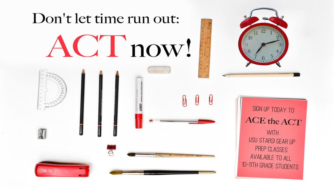
Exhibit 3 - USU Stars Digital Display
After reading about the USU Stars! Gear Up program and the different mentoring opportunities and programs they offer to students, I decided to focus on the ACT test. I wanted to create a poster that reminded 10-11th grade students that they should not procrastinate taking this important test and that, with the help of USU Stars! ACT prep classes, they will be ready to ace it!
I adjusted the image in Photoshop by using the paint tool to remove two rulers that were where the text was in the top left-hand corner of the poster. I also used the paint tool to remove a coffee cup and replaced it with the clock. I wanted a clock in the photo so that the saying "don't let time run out" would make more sense. I also used the quick selection and paint tools to make the clock red instead of black so that is would match the other red objects and provide a "pop" of color in the image. I used red text for "ACT" so that it would provide contrast to the surrounding black text and show repetition of color. I chose to use a bold Serif text for the main phrase as well as "ACE the ACT" so that it would stand out and a San Serif font to provide information, but not distract from the bolded words. Repetition is shown in color choice, school supplies, and fonts.
Fonts used: Big Caslon + Ostrich Sans Rounded
Credit for images: https://www.pexels.com
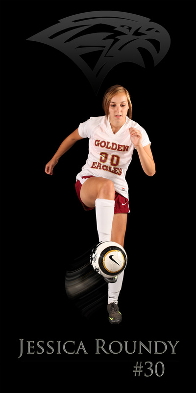
Exhibit 4 - Poster
This week I decided to create a poster using a picture I took of a soccer player. I used the different Photoshop tools to remove her from her previous setting and place her on a non-distracting background. I used different brushes to create the effect that the ball was being kicked and was moving through the air. I wanted to add some dimension to the text, so I used three different effects to make it not look so flat.
Photoshop skills used:
*Quick Selection tool
*Eraser (used to touch-up the Quick Selection and Brush tools)
*Brushes
*Paintbrush
*Text
*Bevel & Emboss, Satin + Outer Glow effects on the text (to give dimension/3-D appearance)
*Bevel & Emboss, Inner Glow, a + Gradient Overlay on the symbol (to change color and fade into background)
Font used: Trajan Pro
Credit for brushes: www.brusheezy.com
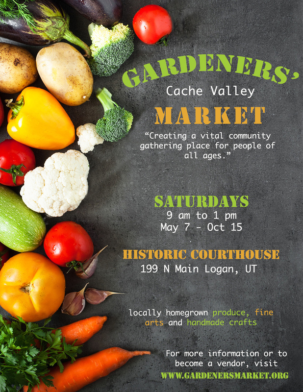
Exhibit 5 - Information Poster
For this poster, I wanted to create something fun for the local farmer's market in Logan, UT. I wanted to make sure to incorporate vegetables since fresh produce is a big part of this event and provide all the information necessary for the viewer to attend.
Photoshop skills used:
*Contrast/brightness
*Layers for each set of text
*Text and color
*Tools within the text tool (curving the text)
*Allignment
*Color
Fonts used: Stencil Std & Ayuthaya
Credit for image: www.shutterstock.com
Exhibit 6 - Business Card
I created this business card for my photography company. I wanted to have florals and other natural plant forms to represent my photography style and love for nature. I tried to base my color choices off of earth tones, since most of my photography is done in the outdoors.
Photoshop skill used:
*Layers
*Text (two different fonts used)
*Contrast (light and darks between font, background, and imagery)
*Center Allignment
*Brush tool (add/create imagery)
*Eraser (to get rid of parts of the florals that didn't balance the work)
*Repetition (color, florals, and fonts repeated)
*Proximity (used opacity to overlay imagery next to each other)
Fonts used: Janda Flower Doodles, Helvetica Neue, & Angelface
Credit for fonts: www.dafont.com
Credit for brushes: www.brusheezy.com
|
|
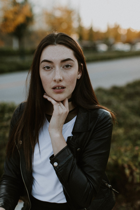
Exhibit 7 - Retouching
For this project, I wanted to focus on retouching a photo I took of Abby, so that is looked more professional + had an editorial feel.
Photoshop skills used:
*Layers
*Frequency Separation (smooth out the skin)
*Gaussian Blur (smooth skin)
*Contour Lighting (make lighting on skin softer)
*Layers
*Curves Adjustment Layer (darken darks, brighten lights)
*Spot Healing Brush (get rid of addition freckles/blemishes)
*Brush tool (refine + contour her face with additional shadows/highlights)
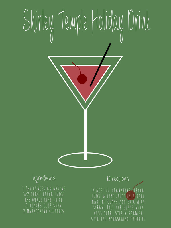
Exhibit 8 - Holiday Poster
This week I chose to do a holiday drink recipe poster that could be made into a series. I chose to do a Shirley Temple so I could work with the upcoming holiday colors.
Photoshop skills used:
*Layers
*Shapes (ellipse, rectangle, triangle, rounded rectangle)
*Color/Paint Tool
*Text
*Allignment
*Eraser
*Proximity
Fonts used: Brain Flower & Always Forever
Credit for fonts: www.dafont.com
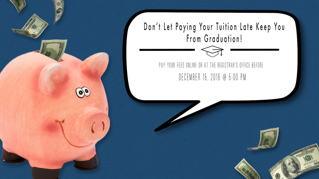
Exhibit 9 - Real World Project
This week's project was created to remind students about the upcoming tuition and fees deadline. I wanted to make sure that the background related to USU, so I made it the same color as USU's logo. I also wanted it to be a reminder for graduating students how important this deadline is for them if they want to graduate on time.
Photoshop skills used:
*Quick Selection (bank, money + graduation cap)
*Fonts
*Layers
*Paint bucket (background)
*Drop Shadow
*Free Transform
*Alignment
*Repetition
*Proximity
*Contrast
Fonts used: Futura & Ostrich Rounded
Credit for images: pixabay.com
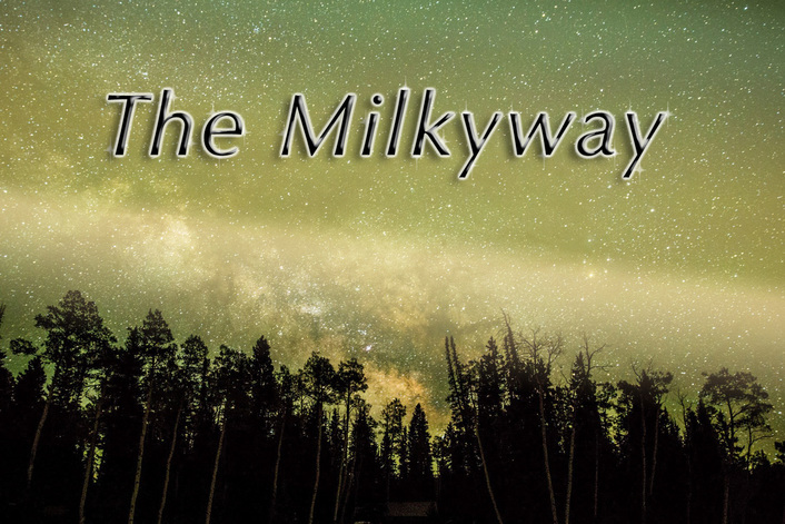
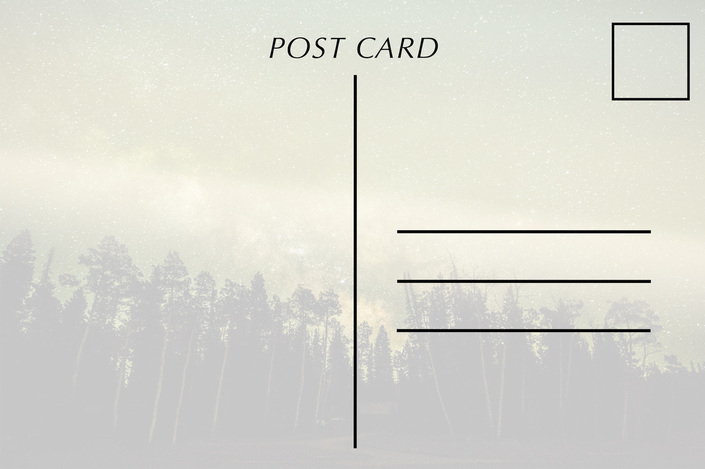
Exhibit 10 - Post Card
For this week's project I decided to create a post card with an image I took of a meteor shower. I created a style and used it on my text to help it stand out from the background. I wanted the text to have a luminous effect since my photo is of the many stars in the sky. I also created a new gradient and added that to the sky to add an extra bust of light and color.
Photoshop skills used:
*Paintbrush (additional stars by the text)
*Gradient
*Styles
*Opacity (gradient and style)
*Alignment
*Proximity (closeness of the lines on back of post card)
*Drop Shadow
*Contour
*Inner Shadow
*Bevel & Emboss
*Outer Glow
*Gradient Overlay
*Text
*Shapes/Lines
Fonts used: Optima
